
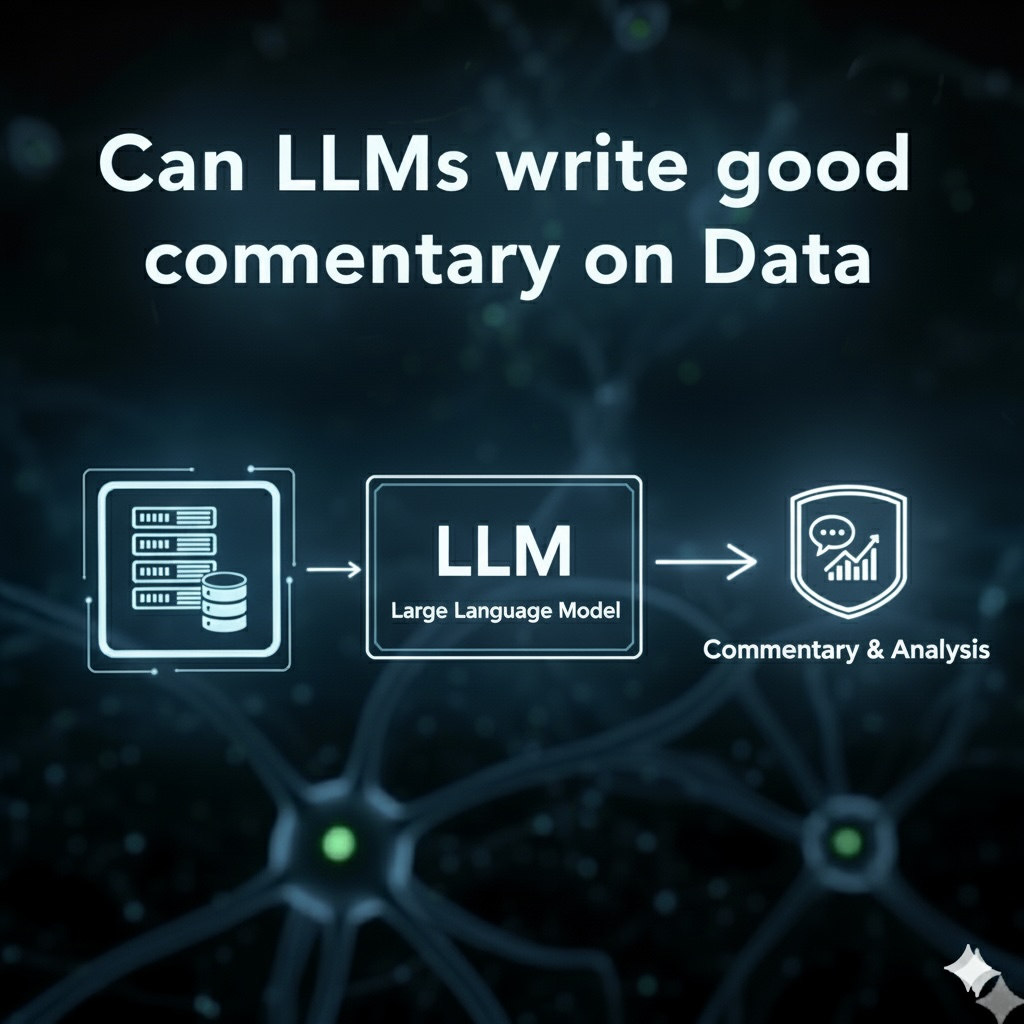
We know that Large Language Models (LLMs) are excellent at summarising documents, but how good are they for writing commentary on financial data? This blog looks in detail at such a task, one commonly performed by analysts.
Background
As readers will know, I periodically look at data and write commentary on trends and have done so for many years. At Clarus it was mostly Clearing House Volumes, while at Actrix it has mostly been Bank Financial Reports.
As example, in late August I published, Bank Holding Company Financial Statements – 2Q25, which looked at the Consolidated Income Statement of the six largest US Banks and in particular Non-Interest Income and it’s components, Trading Revenue, Investment Banking, Securities Brokerage, etc.
From that blog, I extracted the following:

A chart with the most recent 5 quarters of data for the six largest banks, followed by my commentary; in this case seven bullet points, focusing on absolute amounts and share in the latest quarter. Though a glance at the other charts in the blog will show that I also generally cover material year-on-year (YoY) or quarter-on-quarter (QoQ) changes for each bank.
Can LLM’s create similar or better commentary?
Let’s Start
To test that, I first uploaded the latest data for Sep25 into the ActrixFT Dashboard and then added functionality to send the chart data to an LLM and ask for commentary.
Of-course it is not quite as simple as that, I also needed instructions in a prompt to send to the LLM. These instructions include perspective, style, guidance and specific asks, amongst other things.
First the new chart for Trading Revenue.

Then iterating with different prompts and LLMs, to get output commentary that I was happy with.
In the end, I went with a strict 3 bullet point output.
Let’s look at the output from 4 different LLMs.
ChatGPT

What do I think about this?
Well, its pretty good:
- The first bullet point covers JP Morgan Chase, which is good as it is the highest absolute amount of Trading Revenue at $11.2 billion and it also highlights the YoY increase of 9.7%. I would also have written this as the first bullet point.
- The second bullet covers Goldman Sachs, where revenue declined 15.3% QoQ.
- The third bullet covers Wells Fargo with a 70% QoQ rise and 9% YoY decrease.
As my instructions asked for 3 bullets, the above is fine, though on balance I would have preferred a different second or third bullet; one that highlighted Citigroup as down -20.6% YoY, a drop that is also larger in absolute dollar terms than either of the ones selected.
(Note the specific model I used was GPT 4 Turbo).
Claude
Next, I used two variations of the Claude LLM, first Claude Sonnet.

Then Claude Haiku, a smaller/quicker model.

Thoughts on these:
- Sonnet and Haiku certainly live up to their names in terms of the relative number of words each outputs
- The first bullet appears to have the same content for both, again covering JP Morgan Chase, just expressed more succinctly by Haiku.
- However on closer inspection, we see that for QoQ Sonnet notes this as a 0.6% decline while Haiku has it as a 0.6% increase! The correct response is an increase, though so small that I would rather not have it highlighted
- For the second bullet, Sonnet selects Goldman Sachs, just as ChatGPT did, though it gives more detail by including YoY decline and noting the consecutive quarters of decline
- Haiku for the second bullet covers Morgan Stanley with 23.3% YoY increase
- The third bullet has Sonnet select Bank of America and Morgan Stanley for YoY growth, while Haiku has Bank of America and Goldman Sachs for QoQ declines
- On balance I prefer the YoY for Sonnet here as QoQ comparison’s are more seasonal as the Sep25 quarter will have included quieter summer months
Cohere
And one more LLM, this time Cohere, which I have not covered before, but I was drawn to their focus on enterprise and business solutions.

- The first bullet starts with JP Morgan Chase and the near 10% increase which is good and then it draws a comparison with Bank of America and Goldman Sachs as experiencing QoQ declines, which is interesting as these are the only two with QoQ declines, but I would preferred these to be a separate bullet
- The second bullet has Citigroup & Morgan Stanley with QoQ growth, which would have been better noted alongside the two banks with QoQ declines.
- The second bullet also mentions Citigroups 20.6% YoY decline, one I pointed out earlier that I would like to have seen selected as the second bullet
- The third bullet is Wells Fargo’s QoQ increase and YoY decrease, same as ChatGPT
Executive Summary
As well as Trading Revenue, the Dashboard has LLM Commentary on each chart selected, which I set as Total Non-Interest Income, Trading Revenue, Investment Banking Fees and Securities Brokerage.
So for an Executive Summary, I passed all the LLM Commentary bullet points, 4 charts each with 3 bullet points, so 12 in total to the LLM API and asked for an Executive Summary consisting of only two points.
Let’s see how each LLM did.


- Top Performer, both ChatGPT and Claude went for Morgan Stanley based on it’s YoY growth, while Cohere went for JP Morgan Chase as the largest and strong growth
- Both selection are good, though in balance I would have plumbed for Morgan Stanley
- Key Trend, the picture is more mixed here and I don’t think any of the LLM’s did a great job here, sure they were limited by not knowing the relationship between Total Non-Interest Income and the other 3, which are it’s major components.
- Still, given more time I could have worked out how to improve this
Thoughts
Commentary from each of LLM was acceptably good.
Not a lot to choose between them, demonstrating the convergence of frontier models to similar levels; at least for simpler tasks.
Writing the prompt to guide and instruct the LLM was time consuming, but once done worked well.
I did end up calculating and adding QoQ% and YoY% columns to the data before sending to the LLMs.
Because while LLMs were able to calculate these, too often mistakes got made, sometimes as high as in 1 in 3 of the bullets, which is un-acceptable! I assume this is due to sometimes not using code for the maths, either way it got frustrating and it was easy and much better to pre-calculate these in code myself and add to the data.
Repeated invocation of the same LLM, also generated similar results within the constraints imposed by the 3 bullet format.
So the first bullet point was always JP Morgan Chase and the wording had the same content with a minor variation in wording.
The second and third bullets did vary as to which bank was selected, but that is expected given the constraint of 2 bullet points and a human would have done the same.
I could have further improved the LLM commentary, by experimenting more with style, possibly allowing more bullet points and suggesting other measures such as market share.
The Executive Summary could certainly be improved for instance by specifying in the prompt that Total Non-Interest Income was the sum of the other metrics, allowing more granular analysis of the changes.
The LLM commentary remains very factual, but that is what I want for my periodic blogs to back-up the charts.
The real benefit is that once I have a prompt I am happy with, the commentary generation can be automated.
It would be interesting to see if adding Web Search, would result in the LLM extracting a relevant comment made by a Bank’s CEO or CFO in an annual report or news article.
I can certainly do that in an adhoc fashion in the ChatGPT or Claude Apps and iterate over a few responses and questions to drill-down and try and learn more on a specific change.
In Summary
- Question: Can LLMs write good commentary on data, highlighting noteworthy changes?
- Answer: Absolutely, with good prompt instructions on perspective, style and content, the factual commentary on LLMs is on par with that which an analyst would write.
- Question: Are specific LLMs better on writing commentary on data than others?
- Answer: All the leading LLMs perform comparably well on such data analysis tasks, so the choice comes down to personal preference, availability and cost.
- Question: When asking for commentary on data from LLMs, what sort of issues should I watch out for?
- Answer: Care should be taken to check any numeric calculations such as YoY percentage changes. Potential errors can be eliminated by constraining the problem, in this case by adding in calculated derived data for YoY percentage changes using explicit code, which the LLM can then use directly.
- Question: Will LLMs mean less jobs for analysts?
- Answer: There are different views on this. Either LLMs will allow the tedious factual work to be automated, freeing up analysts for higher value work or LLMs will improve so much that significant numbers of analyst roles will be eliminated. The later can only happen if LLM’s develop self-learning capability, so as you use them they get better with experience, much as a trainee analyst would. That is the next frontier for LLM development.
Leave a Reply